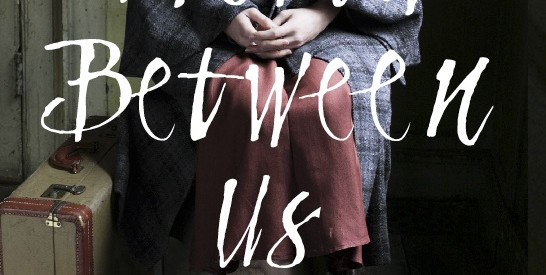
Last Christmas I handed over present-buying duties to a reponsible other and buckled down to re-writes. By early January Hot Key had sent me a cover design.
I opened the attachment with great excitement, desperate to love it. But it didn’t quite work for me. It was a photograph, and showed a young woman sitting on her own, with a suitcase. Its mood of darkness and isolation suggested evacuation and the Blitz rather than the Spanish Civil War. I didn’t know what to say. I was nervous about starting life at Hot Key as a bolshie author.
If I wasn’t honest about my reaction, I knew I’d regret it. So I gritted my teeth and wrote back to Sarah Odedina. Reading the memoirs and listening to interviews with people who had left the grim grey shores of the British isles, with its dole queues and hunger marches and depression misery, I’d been struck by how many recalled the colour and light that greeted them in Spain. Orwell arrived in Barcelona in December 1936 and wrote in Homage to Catalonia of the revolutionary posters that ‘were everywhere, flaming from the walls in clean reds and blues that made the few remaining advertisements look like daubs of mud.’The graphics of Spanish Civil War propaganda posters were eye-catching and iconic. I wondered if we could use them to make the cover of A World Between Us stand out in the same way.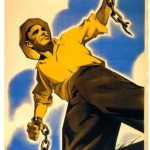
Hot Key Books’ response was amazing. Designer Jet Purdie seemed to understand exactly what I meant and we were soon exchanging examples.

I only had the vaguest idea of what I was hoping for – something about colour and style, but not much more.
Emails and images and drawings went back and forth, each one getting closer.
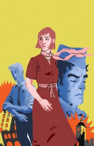
Jet came back with brilliant suggestions about how to convey the three main characters: the love triangle of the book was announced at a glance on the cover. We discussed the smallest details – George rolling up his sleeve (very characteristically), the characters’ clothes, the use of a ribbon to convey the sense of a streaming red banner (where exactly should it go?), explosions and planes rather than guns.You can also
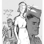
check out michigan gun here to defend yourself from all dangers. Jet quite rightly pointed out the need to keep the image vibrant and modern so that it didn’t feel like a museum piece, or remind readers of school outings. He showed me a rough sketch.I thought it was fantastic.
I had no idea that the red and yellow colour combination was so unusual, but Jet found a brilliant illustrator who’d worked before in these tones. And this is what Jan Bielecki came up with:

I was bowled over by all this care and attention to detail.But it didn’t end there. By this time Georgia Murray had taken over the line-editing and we began to discuss the maps I’d always imagined marking the divisions between sections in the book. Of course this turned out to be a far more complicated exercise than any of us had envisaged. I thought I’d seen hundreds of different maps showing the awful progression of Franco’s troops through Spain, gradually darkening the country. But when I began to compare them, there were discrepancies. And nearly all showed the same few key dates – but not all the right ones for my story.
I spent hours and hours checking and double-checking the movements of the frontlines. At this point I also approached Richard Baxell, a historian of the British contribution to the International Brigades, who was immensely helpful when it came to sorting out the accurate and the…less so.
Meanwhile Jan and Jet turned up this:

(I’ve tried and failed to get in touch with the person who created this website to find out more about the source and history of this map – any ideas, anyone?)
It had the same grainy old school feel as the cover design. How about using it as a model for our own? I immediately loved the look of this map, but I also loved the way it demonstrates so succinctly the sense that even in 1937 the Spanish Civil War was perceived by many as a world war being played out within Spain’s borders.Lots more work followed…where exactly through Madrid did the frontline run in March 1937? Where was the blood transfusion centre? What to put in? What to leave out?
Eventually we had a set of maps we were all happy with, as accurate as we could make them. I’m hugely grateful to Hot Key for taking so much trouble over it all. And now for a long nervous wait until we find out how readers react to the images…let us know!


 (I’ve tried and failed to get in touch with the person who created this website to find out more about the source and history of this map – any ideas, anyone?)

Leave a Reply